Chapter 6 Page 9
March 12th, 2013Almanac Reference: Aether
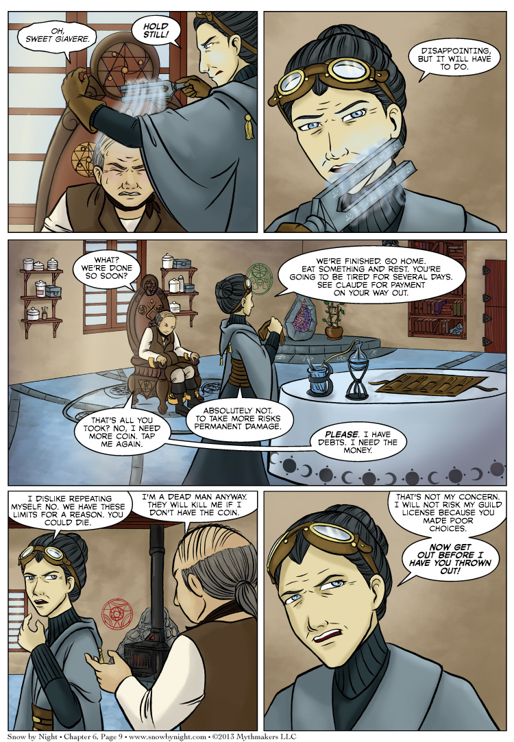
More. You must take more. I need the money. All on Chapter 6 Page 9. To see a peek of Monday’s page, please vote for Snow by Night on Top Web Comics Also, we’ll be at Zenkaikon on March 22-24. We’ll be at Table 17 in the Artist Alley. Come see us as well as our friends Technoangel, Tamuran, and Lesser Key.
The competition in our Art Contest is heating up. Many of the contests are separated by just a few votes. Be sure to vote for your favorite pieces and let your opinion be heard.
Snow by Night made it to Round 2 of the Webcomics Tournament by Comic Mix. Unfortunately, we’ve fallen behind the Abominable Charles Christopher by 36 votes. Please take a minute to vote for Snow by Night. Voting for this round ends March 13 at 9 pm (EDT).
Whew! That was a lot of voting requests for one journal entry. Thank you all for your support.


There is much to love about the new page BUT the old page was better for first-time or long-absent visitors to the site. By showing the whole of the latest page you have essentially given a spoiler to anyone not up on the story. The old site gave only a teaser view of the latest installment and large, easy-to-spot buttons to either go to the latest or the beginning or someplace in between.
I have used your old site to demonstrate what I consider to be an excellent format for webcomics and those I’ve shown agree.This version is very, very nice but in its layout, it looks like almost every other webcomic.
We’ve been getting a good bit of feedback on our old “landing page.” One argument was that it was a shameless way to get and extra click out of people for our adverts. Another argument that when a new visitor arrives we get 45 seconds of their time to make them a fan. With a landing page, we’re eating up half of that time before they even see a page of the comic. The new design was us experimenting with a new way to present our material.
That said, I like the icons for “Begin the Tale” and “Find a Page” and they will be returning to the landing page as soon as we get the graphic icons made for them. I’m not wedded to this new design, and I’m contemplating a new landing page design that includes the two icons with a larger preview image. The old one was just too small. I had a dickens of a time cropping out panels so that they looked good.
What is that stuff? This looks similar to donating blood or something.
That would be the Fifth Element aether. Tapping is the subject of Friday’s almanac entry. Also, Bertrande reveals a little bit more about what she’s doing in next weeks’ pages.
Or donating plasma–with a lot more suffering, apparently.
At the sound of the word “tap” I immediately thought of Magic: The Gathering.
“Guy in debt. 2/2. Costs 1 red mana. Tap to get 2 mana. Sacrifice to get 4 mana.”
Also, nice page. If this is aether they’re gathering, then I can see why it’s so expensive: It requires a human to suffer to acquire, and can only be gained from an individual once every few months.
Great page in general. Really character establishing for both the debt guy and Bertrande, and the art is, as always, fantastic.
Siphoning somebody’s essense? That’s not red….
That’s pretty Black, really.
This would be a great time for an Almanac link as you suggested earlier. I added it to your journal entry.
No, the GUY is Red, not the act of siphoning his essence.
I forgot about Magic using the term. I picked it because it was like tapping the sap out of a maple tree. Since I’m going with the French Canada theme.
I read it in the “tapping a tree” sense, if it reassures you any. But then geeks, and Magic cracks, and something about derailing.